Trickle-down didn't trickle
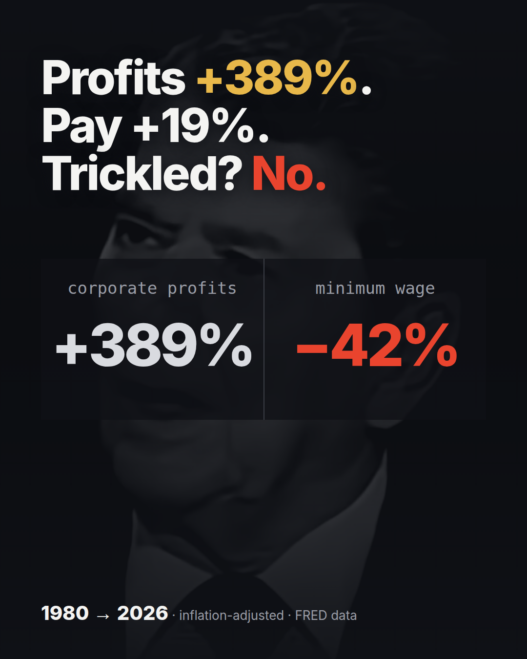
Profits +389%. Pay +19%. Trickled? No.
What trickle-down promised
In 1980 the pitch was simple enough to fit on a bumper sticker. Cut taxes at the top, let the people who own things keep more of what they make, and the money comes back down as investment, jobs and raises. Supply-side economics. Ronald Reagan won that November and took office in January 1981.
The tax cuts were real. The top individual income tax rate was 70% in 1980. The Economic Recovery Tax Act of 1981 took it to 50%, and the Tax Reform Act of 1986 took it to 28% (IRS, SOI Historical Table 23). More rounds came in 2001 and 2003, and in 2017 the Tax Cuts and Jobs Act set the federal corporate rate at a flat 21%, down from a top rate of 35%.
So the policy happened. The question I wanted to answer is the one the slogan invites: did the gains at the top reach the person earning a wage? That is a testable claim, and the data to test it has been public the whole time.
How I built the numbers
Everything comes from FRED, the St. Louis Fed's public database. Three series, plus one to take inflation out:
- Corporate profits: Corporate Profits After Tax, CP, from the Bureau of Economic Analysis. Quarterly, averaged to a year.
- Pay: Median usual weekly real earnings, full-time wage and salary workers, LES1252881600Q, from the Bureau of Labor Statistics. BLS already publishes it in constant 1982 to 1984 dollars.
- Minimum wage: Federal Minimum Hourly Wage for Nonfarm Workers, FEDMINNFRWG, from the Department of Labor.
- Inflation: Consumer Price Index for All Urban Consumers, CPIAUCSL, the CPI-U.
The method is short. Every dollar series goes into 2026 dollars using CPI-U, then each line is indexed so 1980 = 100. A line at 200 means twice the 1980 level in real purchasing power. I used 1980 as the baseline because it is the last full year before the policy took office. 2026 is a partial year: profits and pay are the first two quarters, and CPI runs January through August.
Indexing matters here because the three series live on different scales: billions of dollars, dollars a week, dollars an hour. On one 1980 = 100 axis they share a starting line, and the only thing left to compare is how far each one moved.
One more thing about "pay". It is the median full-time worker's weekly paycheck, not an average. An average gets dragged up by the top earners. The median is the person in the middle.
Profits vs pay
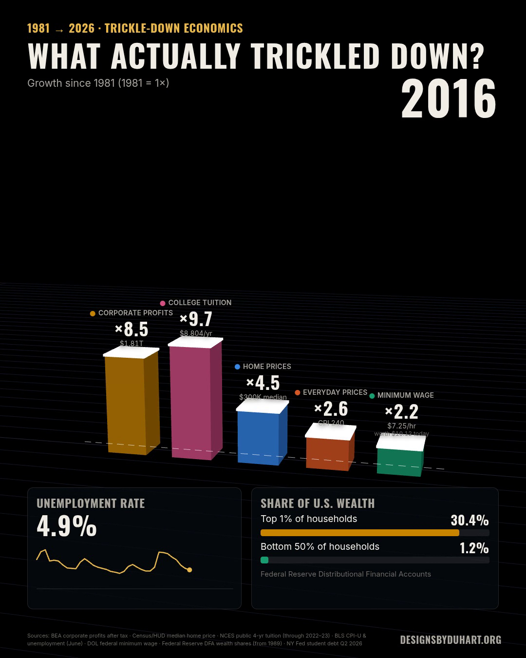
After inflation, corporate profits after tax are up 389% since 1980. That is almost five times the 1980 level. Median weekly pay for a full-time worker is up 19%.
Spread over 46 years, 19% works out to roughly 0.4% a year. Profits grew at about 3.5% a year over the same stretch.
In dollars, the median full-time paycheck was about $1,052 a week in 1980, measured in today's money. Now it is about $1,249. So the typical full-time worker takes home about $197 more a week than their 1980 counterpart did, after 46 years of a policy that was sold as a wage policy.
The gap does not open all at once. Profits wander through the 1980s and early 1990s, climb hard from the mid 2000s, and jump again after 2020. Pay is close to flat for most of the period and only starts to move in the late 2010s. The chart below lets you watch it open year by year.
The gap, year by year
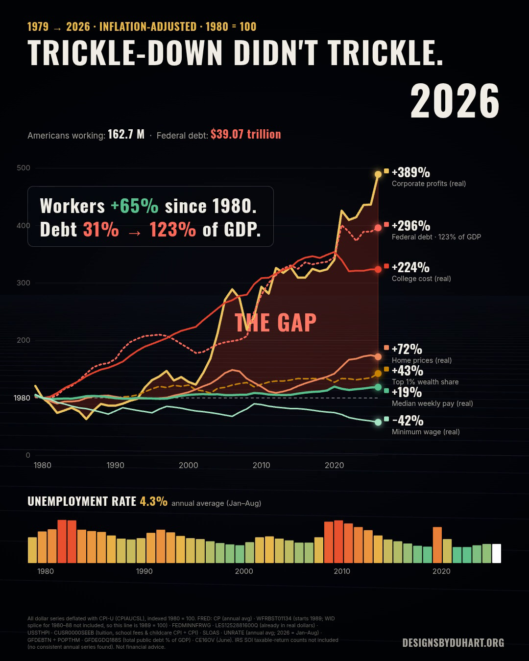
The same lines, animated
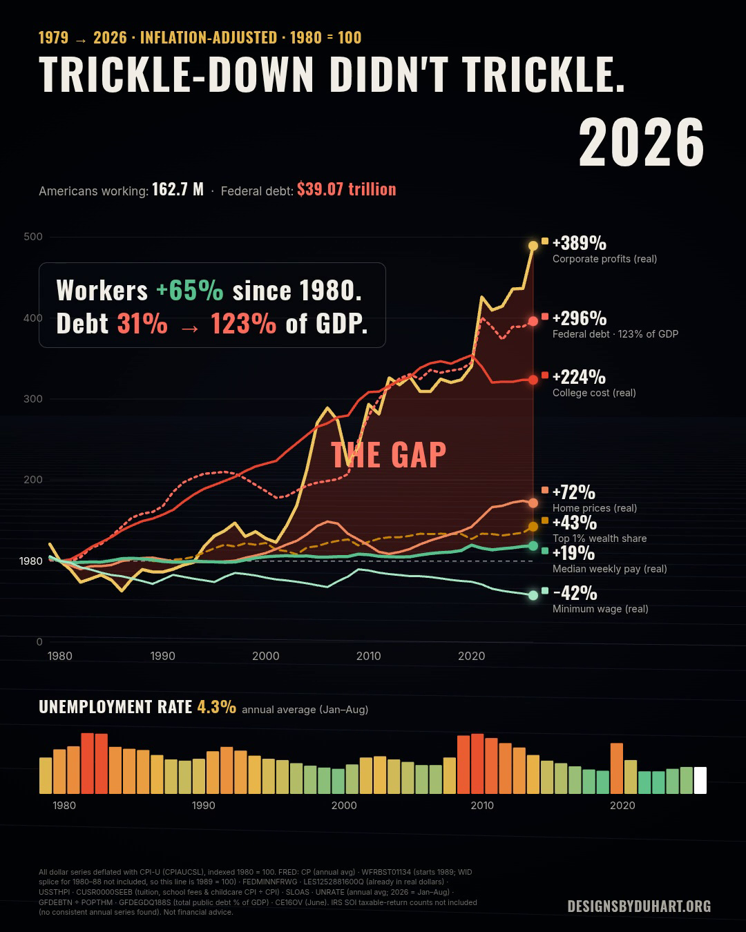
The minimum wage, frozen at $7.25 since 2009
The federal minimum wage was $3.10 an hour in 1980. In 2026 dollars that is about $12.47. Today it is $7.25, the same number it has been since July 24, 2009 (Department of Labor, history of federal minimum wage rates). After inflation it buys 42% less than the 1980 minimum did.
That is the longest the federal minimum has gone without a raise since it was created in 1938. A full-time year at $7.25 is 2,080 hours times $7.25, which comes to $15,080 before tax.
This one is not really a market outcome. Congress sets the number. Leaving it alone is a decision too, and inflation does the cutting every year nobody touches it. Plenty of states and cities set their own higher minimum now, so fewer people earn exactly $7.25 than in 2009. But in the states that never did, the federal floor is still the floor.
The scorecard
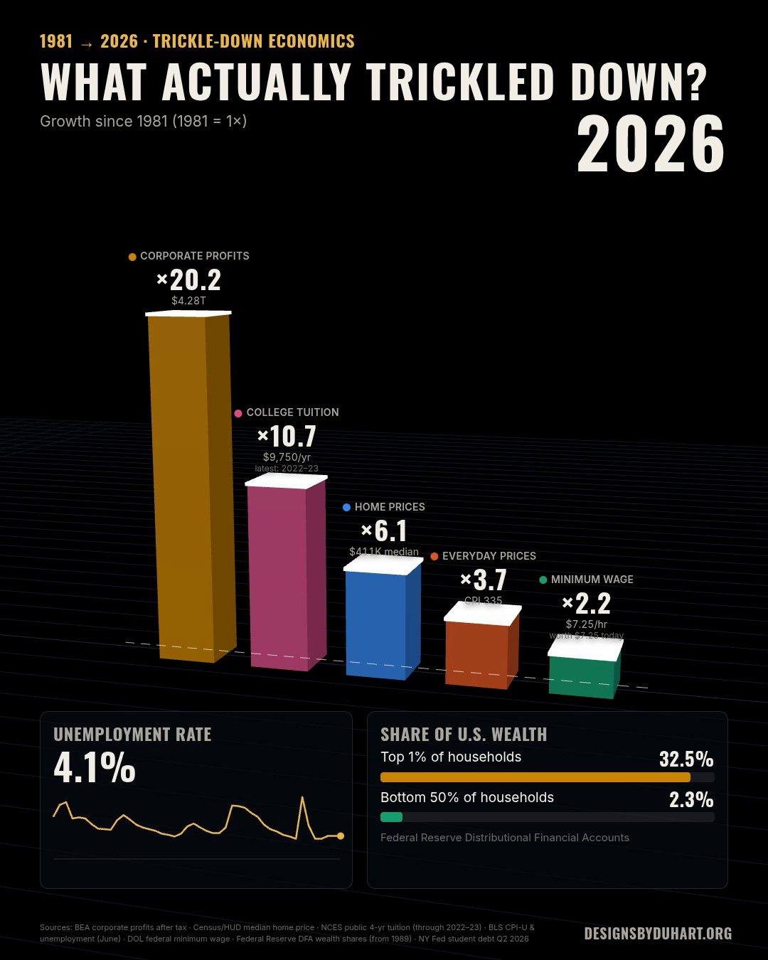
What actually trickled down, animated
Where the money went instead
If the gains did not go to wages, they went somewhere. Three places show up in the public record.
Buybacks. Before 1982, a company buying its own stock on the open market risked being accused of manipulating its price. That year the SEC adopted Rule 10b-18, a safe harbor for repurchases that follow its conditions (SEC, answers on Rule 10b-18). Buybacks went from a legal risk to a routine use of cash. In 2024, S&P 500 companies spent a record $942.5 billion on them (S&P Dow Jones Indices, March 19, 2025).
Dividends. The same companies paid a record $629.6 billion in dividends in 2024, so about $1.57 trillion went back to shareholders in one year (same source). Across all US corporations, net dividends (FRED series DIVIDEND) were $76 billion in 1980 and are running at about $2.2 trillion a year in 2026. After inflation that is roughly 7.2 times the 1980 level, a bigger multiple than profits themselves.
Executive pay. The Economic Policy Institute tracks CEO pay at the 350 largest US firms. By its count, CEO compensation rose 1,316% from 1978 to 2025 while the typical worker's compensation rose 28%. CEOs made 21 times what a typical worker made in 1965 and 325 times in 2025 (EPI, CEO pay in 2025).
None of this is illegal or hidden. That is kind of the point. The money did not vanish. It went where the rules made it easiest to send.
What the data cannot say
A chart like this is easy to oversell, so here are the limits as plainly as I can put them.
- Correlation is not cause. Profits rose and pay stalled after the tax cuts. That does not prove the tax cuts did it. Globalization, the decline of unions, automation, a few very large firms taking more of their markets, and the shift to a service economy all happened in the same years. Economists still argue about how to split the blame, and I am not going to settle it with four lines.
- The baseline is a choice. Profits fell from 1979 to 1980, so starting in 1980 flatters the profit line a little. From 1979 the rise is closer to 300%. From 1982, the bottom of that recession, it is closer to 560%. I picked the last year before the policy, and I am telling you I picked it.
- The deflator is a choice. I used CPI-U. Other price measures, like the PCE index the Fed prefers, usually run a bit lower, which would make every real number here look somewhat better.
- A median hides who is working. In 2020 the median paycheck jumped, mostly because millions of lower paid workers lost their jobs and dropped out of the count, not because anybody got a raise. The bump faded as they came back.
- Pay is not total compensation. Health insurance and other benefits are a bigger share of what employers spend on workers than they were in 1980, and a paycheck series leaves them out. Counting them would narrow the gap some. I do not think it would close it.
- Profits get revised. These are national accounts numbers. BEA revises them, sometimes by a lot, and 2026 is only two quarters of data.
So, did it trickle?
Forty-six years is long enough to call an experiment. Profits nearly quintupled. The median paycheck moved 19%. The minimum wage lost 42% of its value. By the test the slogan set for itself, it did not trickle.
You could argue nobody ever said how much would trickle down, and maybe that was the fine print. I would rather not read it that way.
This is more of a thought piece than a verdict. We look to be heading into a recession and an AI bubble at the same time, and the new pitch sounds familiar: build the data centers, give them the power and the tax breaks, and the jobs will follow. Maybe they will. My read is that most Americans are more against the data centers than for them, but only time will tell.
So here is my question for you. Ten years from now, what would you need to see in the data to believe the AI buildout trickled down?
Next: where the money went instead. Buybacks, dividends and executive pay on the same 1980 = 100 axis.
More: LinkedIn · Instagram. Portfolio and case studies: designsbyduhart.org.
If any of this saved you an afternoon, Buy me a coffee.